

The Challenge
Jaylakshmi Silks carried decades of trust and craftsmanship, but its visual identity had not kept pace with a rapidly evolving retail landscape. The challenge was to modernise the brand's presence without diminishing the authenticity and heritage that loyal customers had come to associate with it. The identity needed to feel premium and contemporary while still communicating the warmth, tradition, and quality that define every piece of fabric the brand offers.
"We carry the legacy of generations in every thread — our brand needed to reflect that same depth and pride."
Our Solution
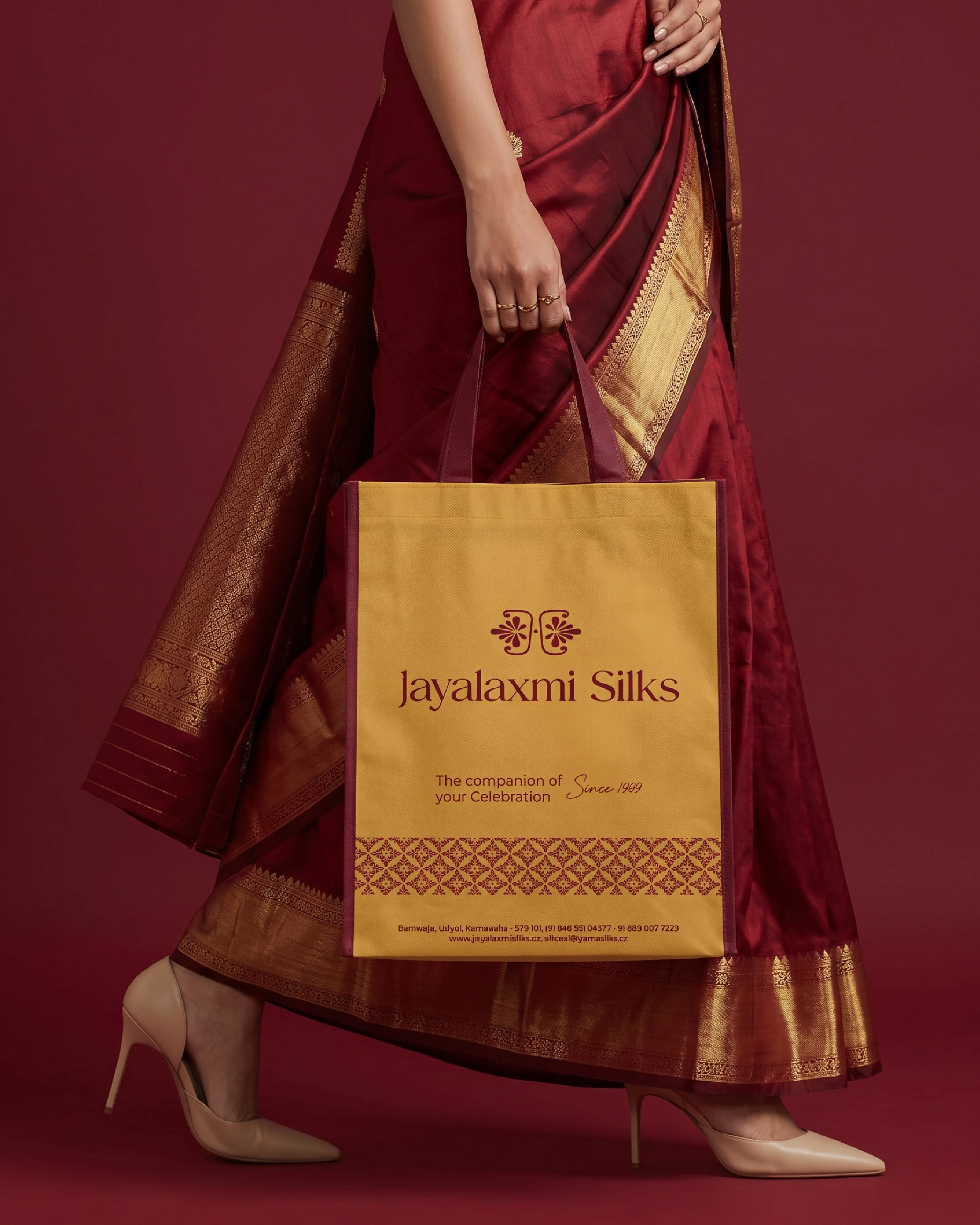
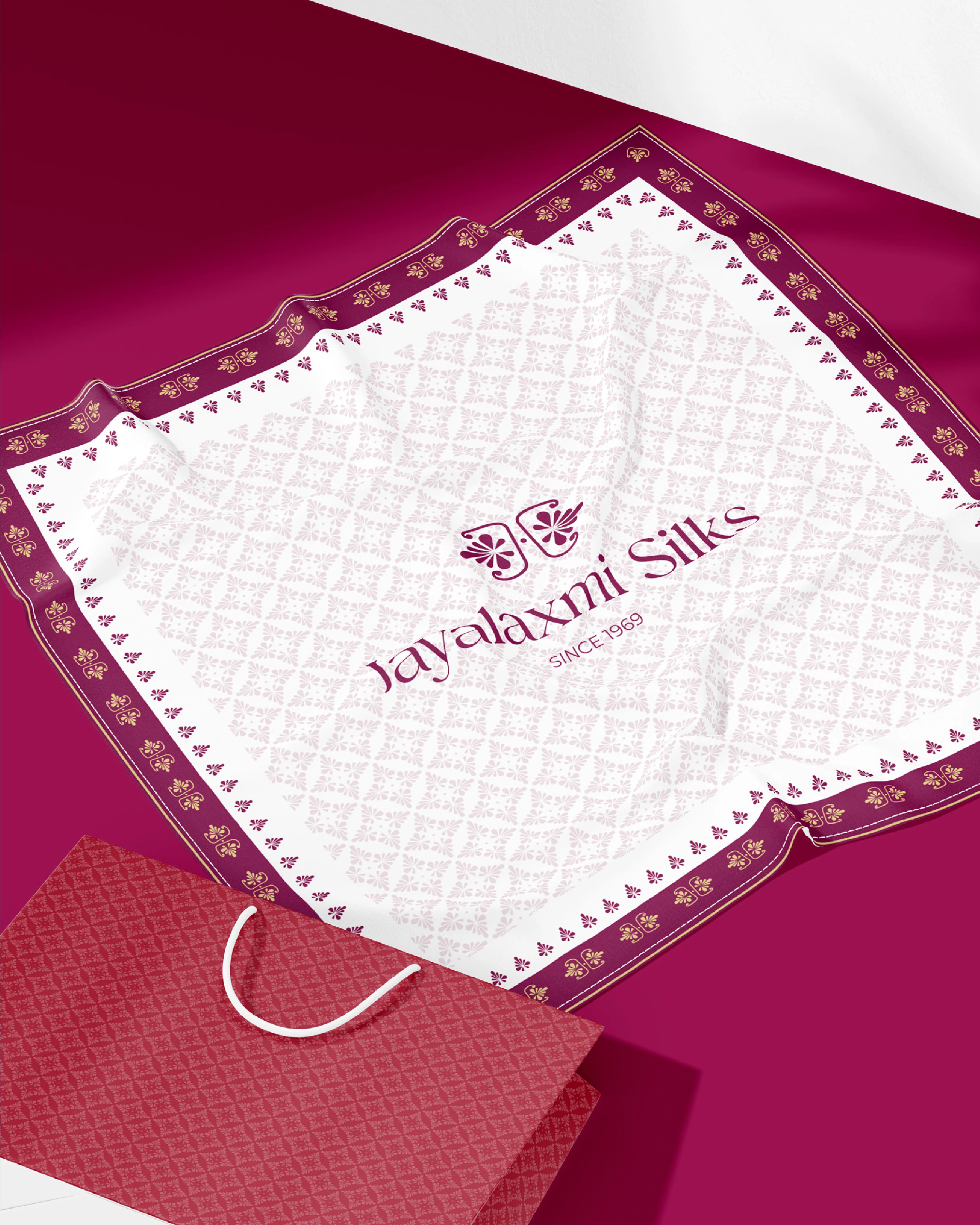
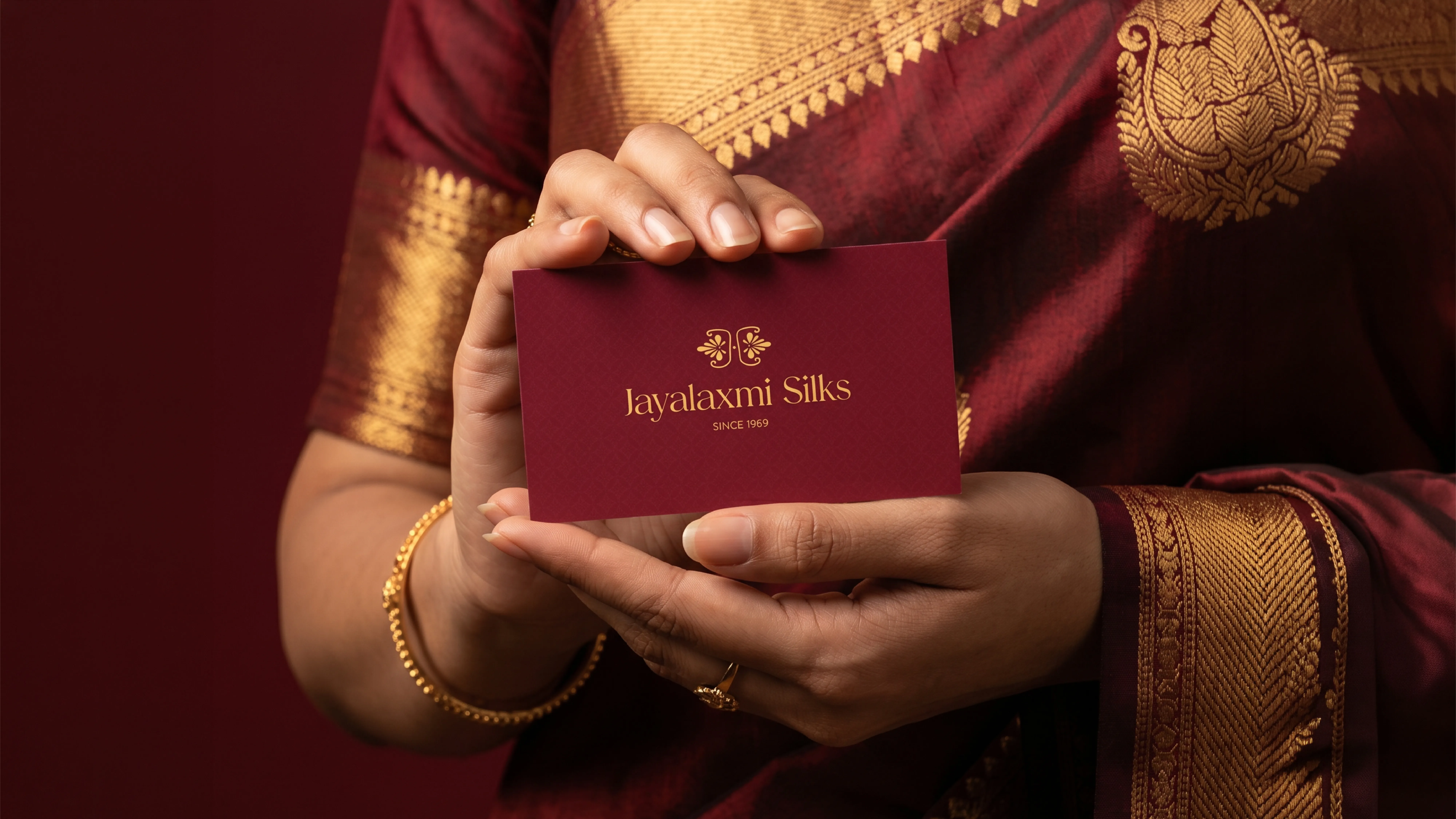
A refined brand identity was developed that drew directly from the visual poetry of silk itself — its texture, sheen, and fluidity. The wordmark was crafted with elegant, purposeful letterforms that communicated confidence and tradition without feeling dated. A rich, considered colour palette of deep jewel tones and warm neutrals was established to evoke luxury, heritage, and cultural resonance. The system was designed to scale seamlessly across storefronts, packaging, labels, and digital touchpoints, ensuring Jaylakshmi Silks presented a unified and elevated image at every point of contact.
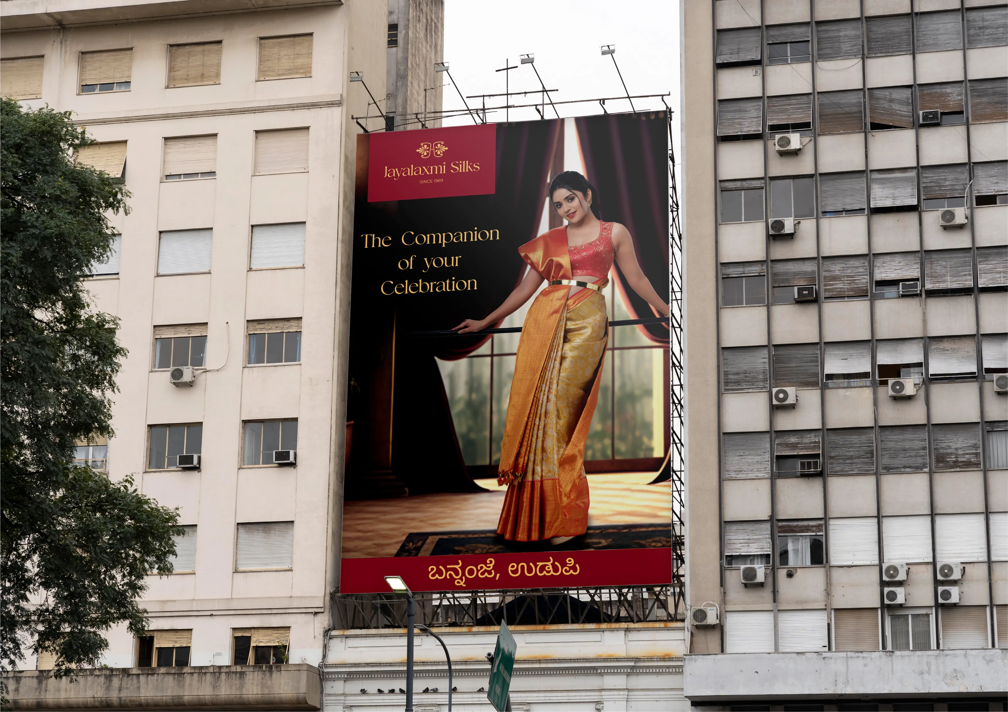
A heritage-inspired identity, crafted with restraint and richness to honour the art of silk weaving.
Inspiration for the identity was drawn from the inherent elegance of silk — its fine texture, the way light moves across it, and the cultural significance it carries across generations of celebration and ceremony. The brandmark abstracts these qualities into a precise and graceful visual form. Fluid lines and deliberate negative space create a sense of movement and refinement, while the overall composition maintains the balance of tradition and modernity. The colour palette was chosen with care, anchoring the brand in warmth and depth, while allowing the identity to feel current and aspirational without departing from its roots.
Project Deliverables
- Brand Strategy & Positioning
- Logo Design & Brand Identity
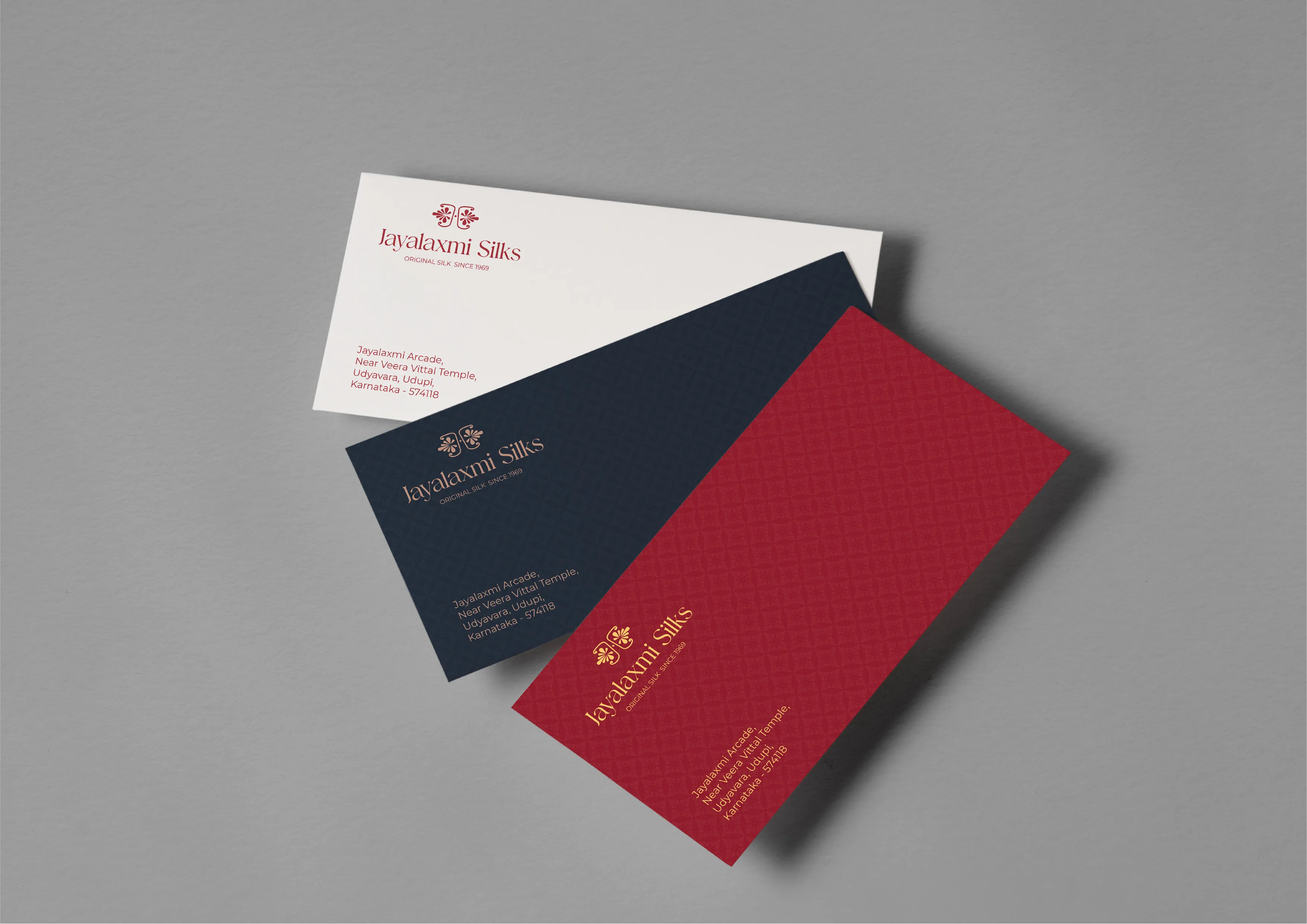
- Retail Signage & Collateral Design
- Packaging & Label System
Our Learning
Working with Jaylakshmi Silks deepened our appreciation for the responsibility that comes with refreshing a heritage brand. The identity could not simply follow contemporary trends — it had to respect a legacy that customers had trusted for generations. The process reinforced that authenticity is the most valuable asset a long-standing brand possesses, and that the designer's role is to translate that authenticity into a visual language that feels both familiar and forward-looking. Restraint, cultural sensitivity, and a deep understanding of the brand's audience were essential to every decision we made.
Measurable
Business Impact
Improvement in Brand Perception Among Younger Shoppers
A refined and contemporary identity attracted a new generation of customers while retaining the loyalty of established patrons.
Increase in Retail Footfall Post-Rebrand
Elevated storefronts and updated brand collaterals created a stronger first impression, drawing more walk-in customers.
Improvement in Visual Consistency Across Touchpoints
A structured identity system standardised presentation across packaging, signage, labels, and digital applications.
Growth in Social Media Engagement
Premium brand visuals and cohesive storytelling strengthened audience interaction and brand recall online.